Hey everyone!

I have taught numerous card classes too. I LOVE the Graphic 45 papers and I often included those in my card classes.
Here is a Prima layout from last spring using the Melody Collection. This was a fun layout class that I taught several times and even did a Live With Prima Episode from one of the classes. I bet that if you really wanted too, you could check the LWP archives and watch the episode:D

Another Prima class, this was using the Printery Collection last fall. I had the privilege of teaching it in the Netherlands and again on a Live With Prima episode. Definitely a great class with lots of tips and tricks for adding lots of sun surprises throughout.

This was not a class but it is a fun piece of wall art I created recently. I used a plethora of Tim Holtz products along with a few other trinkets I have collected over time.

Here is a fun class that I designed for Tattered Angels TV just before Christmas. It features some fabulous Pink Paislee goodies that were altered with Glimmer Mist, etc. I just LOVE the Mistables Collection and if you want a little hint... you just might see some of these products in the Pink Paislee Class I am teaching for the Artsy Adventure Tour;)

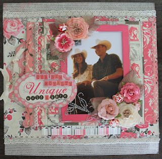
Authentique.... I love their papers and embellishments! They works so very well not only on their own but with others as well. I love the heavy weight textured cardstock.

Those of you ladies whom I met last November as part of Prima ROad Show already know that I am all about the layers and if you look closely, you will notice a few of the same techniques.

I am not so sure how many layers there were on this one but I am fairly certain it was around the 75 mark. YUP! I kid you not...
By the time you flip open the flaps...
and count the tags and layers of papers and embellishments, it does not take long to get to that high number. It's become a challenge lately to see just how many layers I can pile on there and I think this one probably has the most so far!
So a little tidbit you probably didn't know about me... I had the honour of teaching at the uber fabulous Creative Escape in Arizona in 2010(the BIG event put on by Bazzill and Heidi Swapp). So this and the next few pics are of the table display I had showcasing some of my projects...
There were a huge variety of samples there but if you look closely, you will get the idea.
This is not the most flattering picture of me...lol! I am little "puffy" but it was when I was not in the best of health and undergoing some treatments so it'll have to do:) If you have ever been in a class with me, you will know my motto is "Lumps and Bumps are a good thing" and MAYBE I will share where this comes from one day, but let's just say this photo was taken during the time where that became my theory and I have since learned to "Embrace the lumps and bumps" as it is far better than the alternative;)
I do hope these photos have peaked your interest:) Please keep checking back as the ACTUAL class photos are coming soon:D I promise:)
Happy Scrapping!
Trisha


No comments:
Post a Comment